Print Layout
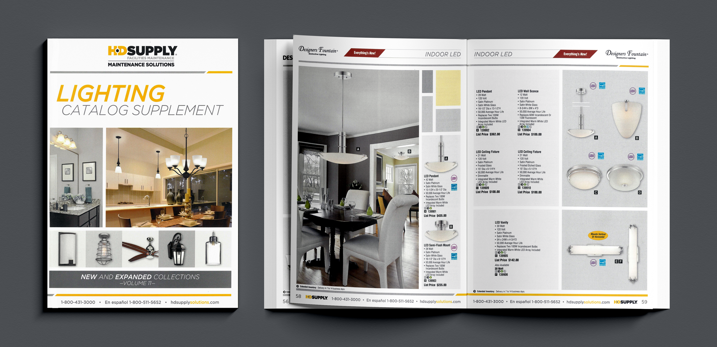
Confession: Before it became passé...I was doing Millennial Gray. I still think this looks pretty sharp though. It's the pops of yellow that save it for me. The structural block elements in the upper right corner of page 58 were not just a clever solution to some awkward negative space. They became the entire design language for this publication. I love that the glamor photos used on both the front cover and page 58 are also in shades of gray and yellow. Tools used: InDesign.
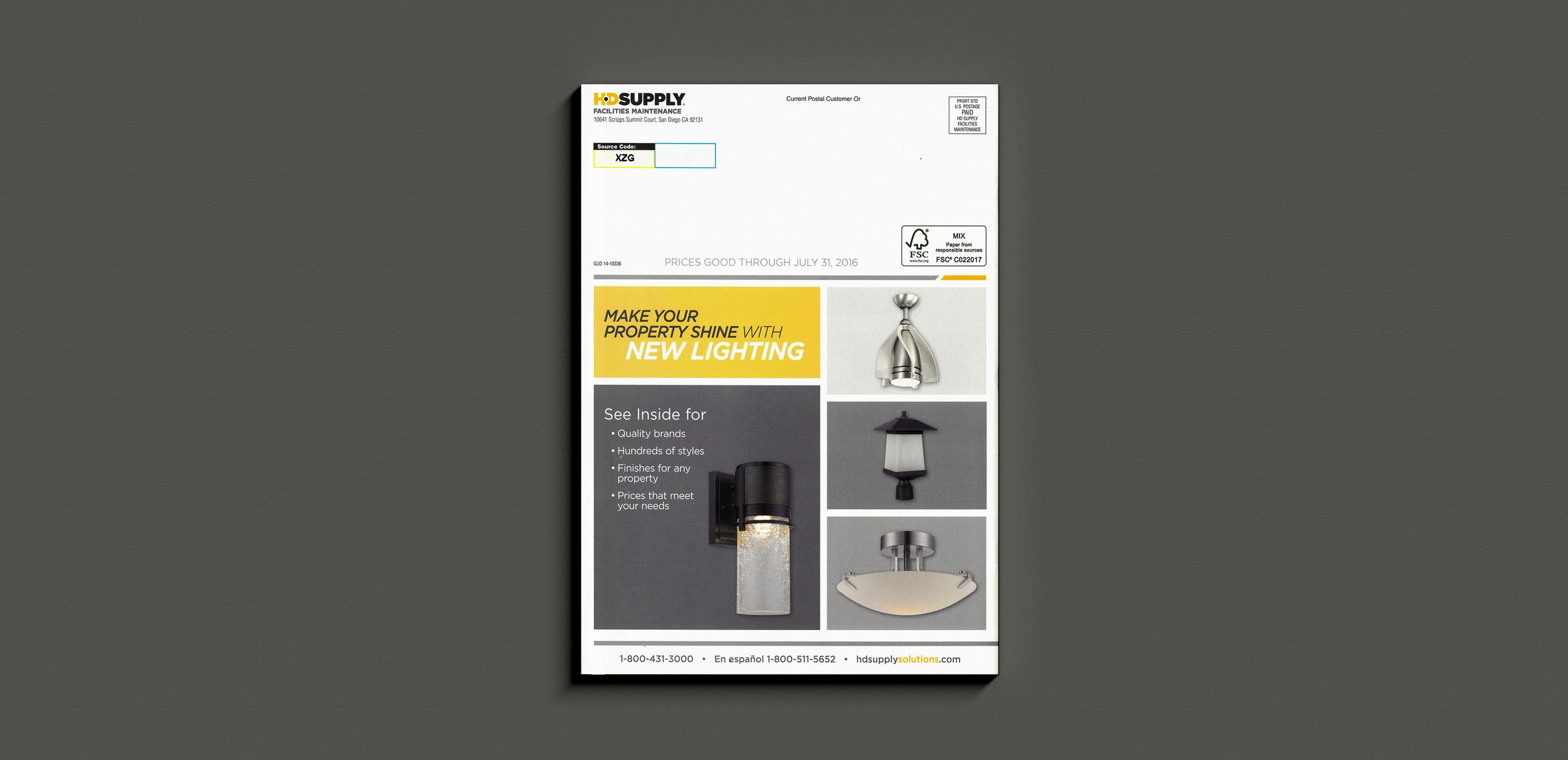
One more example of this concept from the Lighting Catalog Supplement's back cover. Tools used: InDesign.
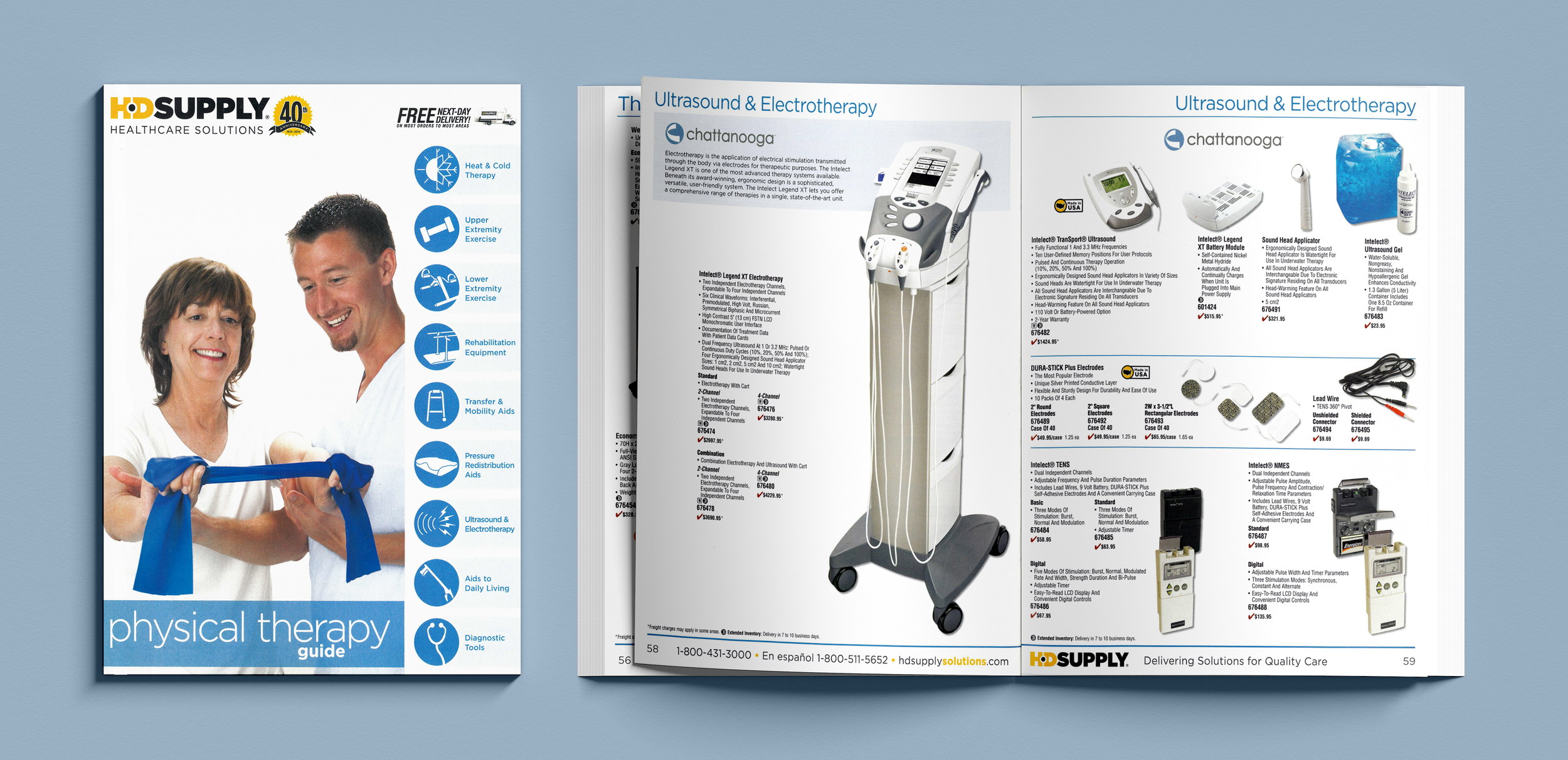
Often catalog layout is about fitting the most SKUs you can, onto the least number of pages as possible. But sometimes, you get an opportunity to do something a little bit different. I pushed heavily for the look of the Physical Therapy Guide - a minimalist feel with lots of white space and accents of blue, a friendly-looking title in all lowercase letters, iconography, and big images wherever possible. I did the icon illustrations myself. I also got to participate in the front cover photoshoot. The models were HD Supply employees. Tools used: InDesign & Illustrator.
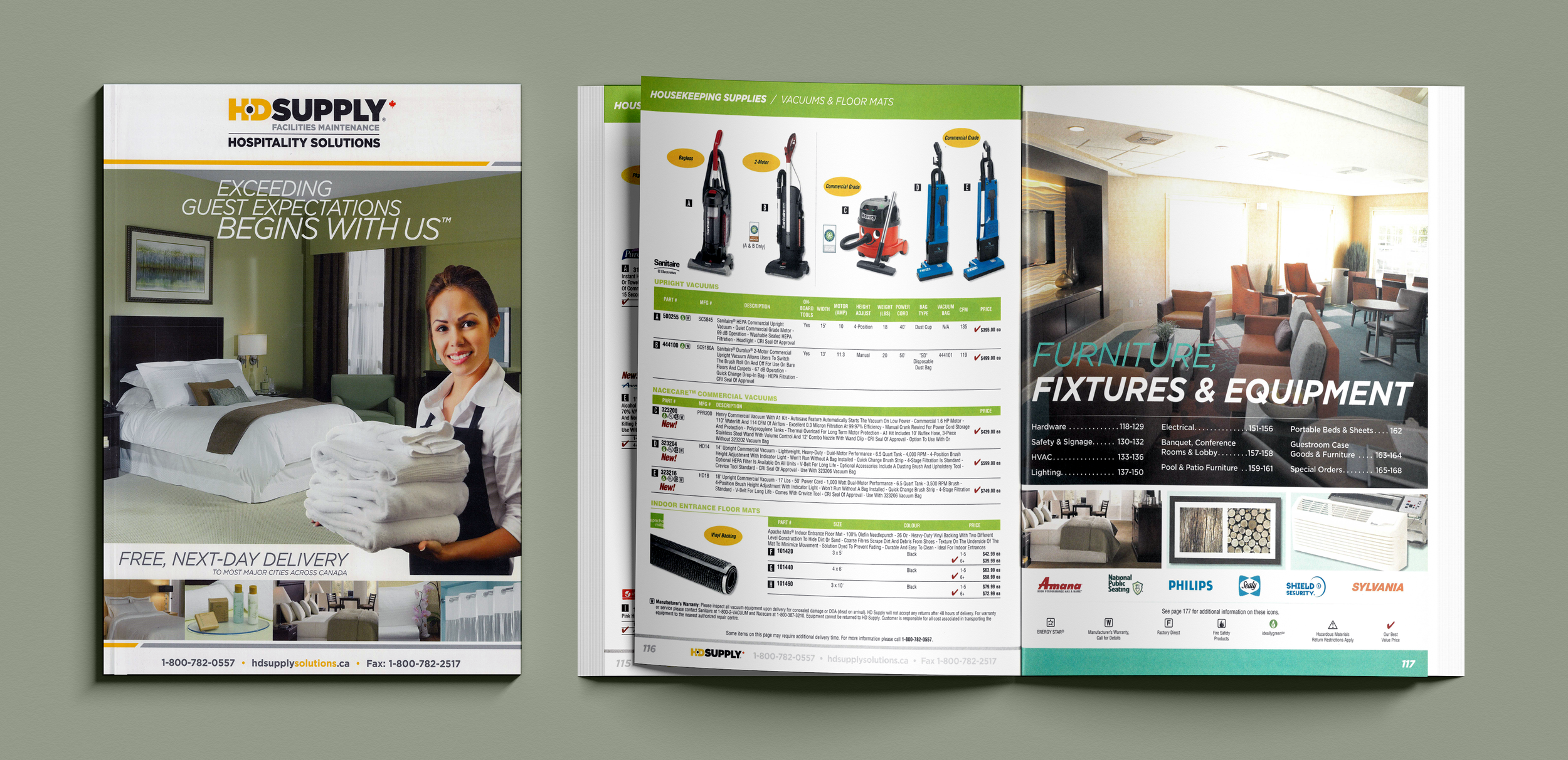
I acted as Design Lead for the Canadian Hospitality Catalog. It's ~400 pages long and was produced over the course of several months with the help of 3 temps. I trained them on design standards and reviewed their work before passing their pages on to my supervisor and other departments for sign-off. Tools used: InDesign.
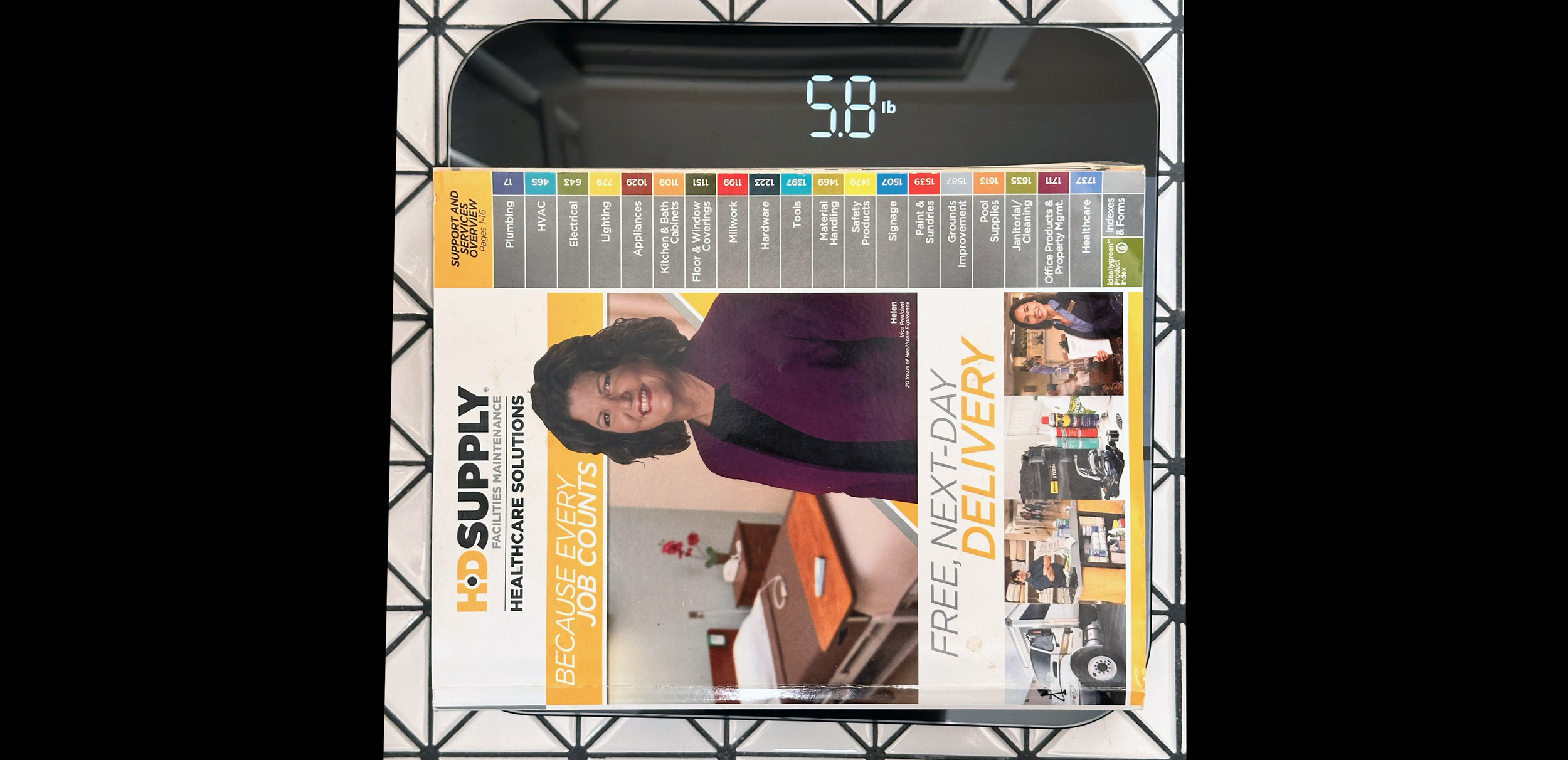
At 2,000 pages long, two inches thick, and nearly six pounds, the behemoth V66 catalog could kill a man. I was Design Lead on this and the previous year's V65 catalog. I trained up and managed a team of 15 temps for 6 months. Twice. Working on THEE HD Supply catalog is hard work and often requires long hours. I proofed their pages, discussed changes, measured their performance, and made hard decisions on who to let go between revision rounds. Tools used: InDesign & Excel.